
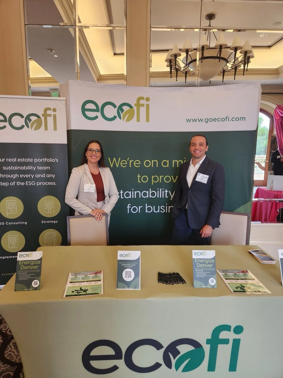
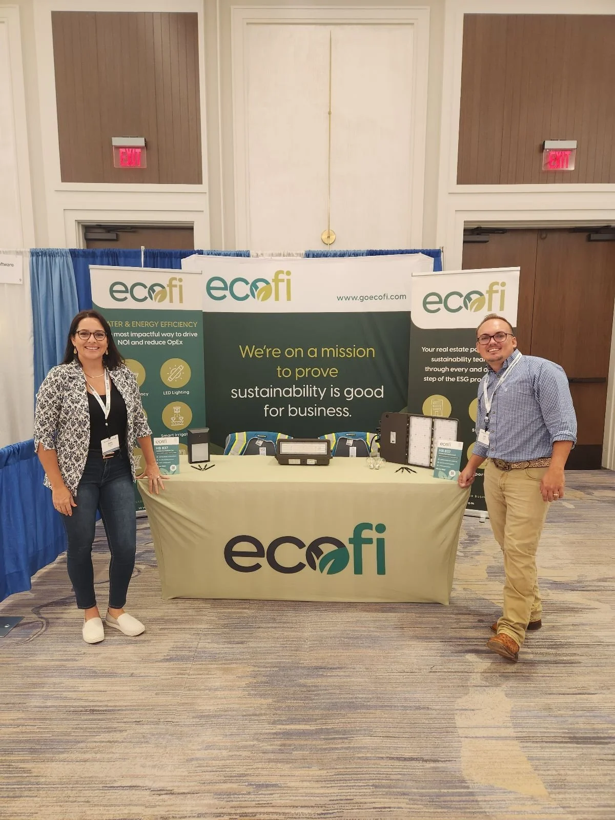
CLIENT: ecofi
SECTOR: B2B
SCOPE: Brand Refresh
Ecofi partners with leading real estate portfolios to embed sustainability into the core of their brand and business strategy.
As their influence and impact grew, the company needed a brand that could grow with them. Formerly known as EcoSystems, they came to us to rename, reposition, and reimagine how they show up in the world—so their identity could reflect what they already knew to be true: sustainability isn’t just good for the planet. It’s good for business.
This is a story about proving that sustainability pays off.

We modernized the logo to feel more approachable and forward-thinking, while expanding the color palette to reflect Ecofi’s evolving impact. The new logomark was designed with flexibility in mind—something the team can pull apart and use confidently across channels.


Richard Lamondin
Co-Founder

“GSO came in with a fresh pair of eyes and loads of expertise, completely transforming our brand logo and colors. Now, we’ve got a sleek, modern look that really breathes life into who we are as a company. If you ask me, their creative strategy is top-notch. we can’t recommend them enough!”